A story about creating jewellery that has made deep emotional connections with people who love this stunning Scottish Island.
First produced as a limited edition in summer 2025, the small number of pieces sold out as did most of the second batch made for Christmas markets. I’ve been blown away by how popular this jewellery is. And so another small Limited Edition batch for 2026 is now ready.
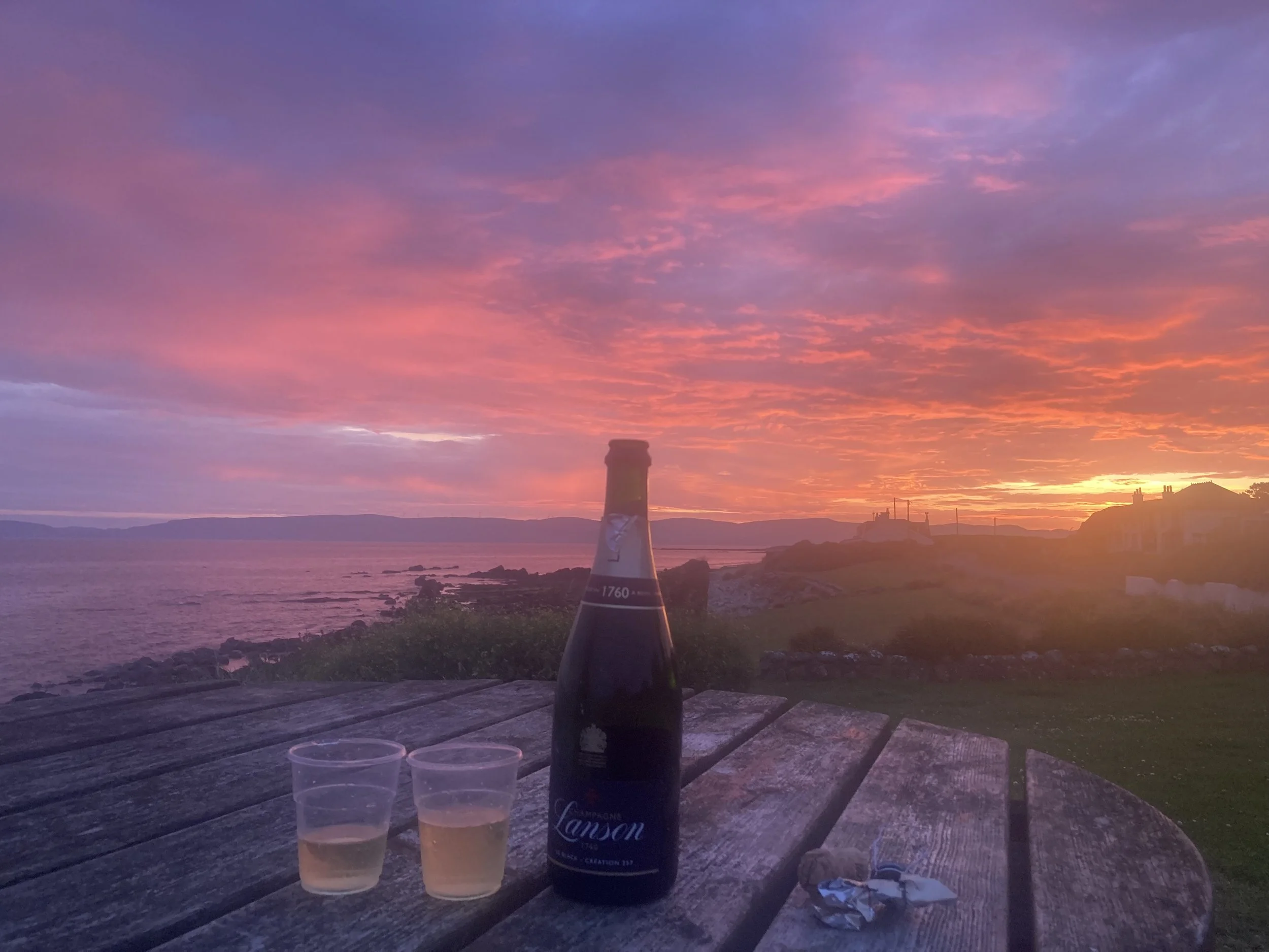
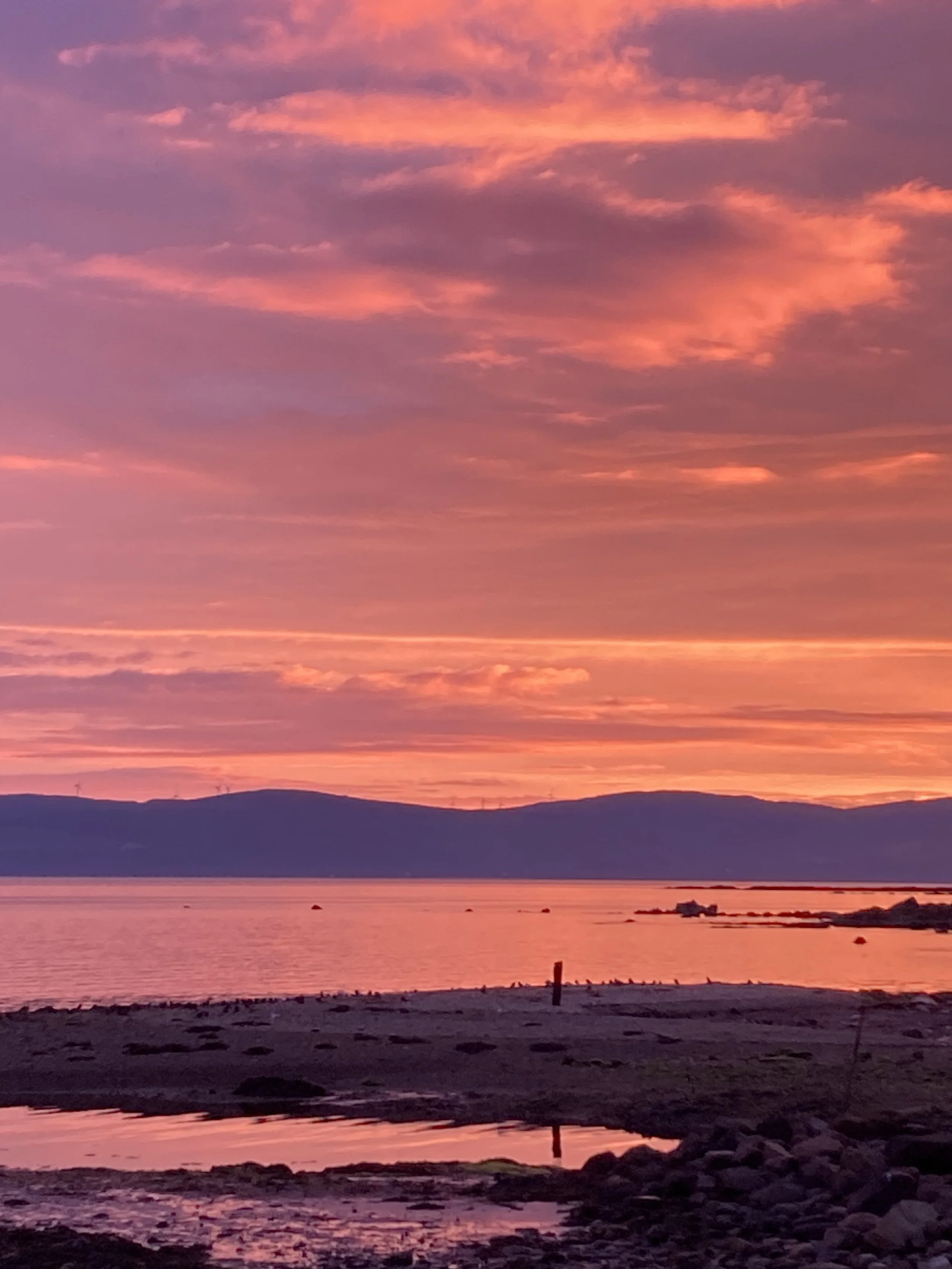
My first connection with Arran and Blackwaterfoot was in 2024; during a week in July with mostly sunny weather and fabulous sunsets. A dream I’d had of watching the sun go down while enjoying some champagne, amazingly came true!
To the rear of this picture stands the local hotel; the Kinloch, where we enjoyed lovely meals and drinks on the terrace after long walks. What struck me was the number of multigenerational family groups enjoying their stays in the local hotel - it took me back to my own childhood.
Nostalgia is a key theme I’ve picked up in many many lovely conversations at markets. Discovering just how popular Arran is, especially for people from other parts of Scotland for whom Arran was their special place for childhood trips and then their own family holidays. And for many Blackwaterfoot was their favourite place in Arran.
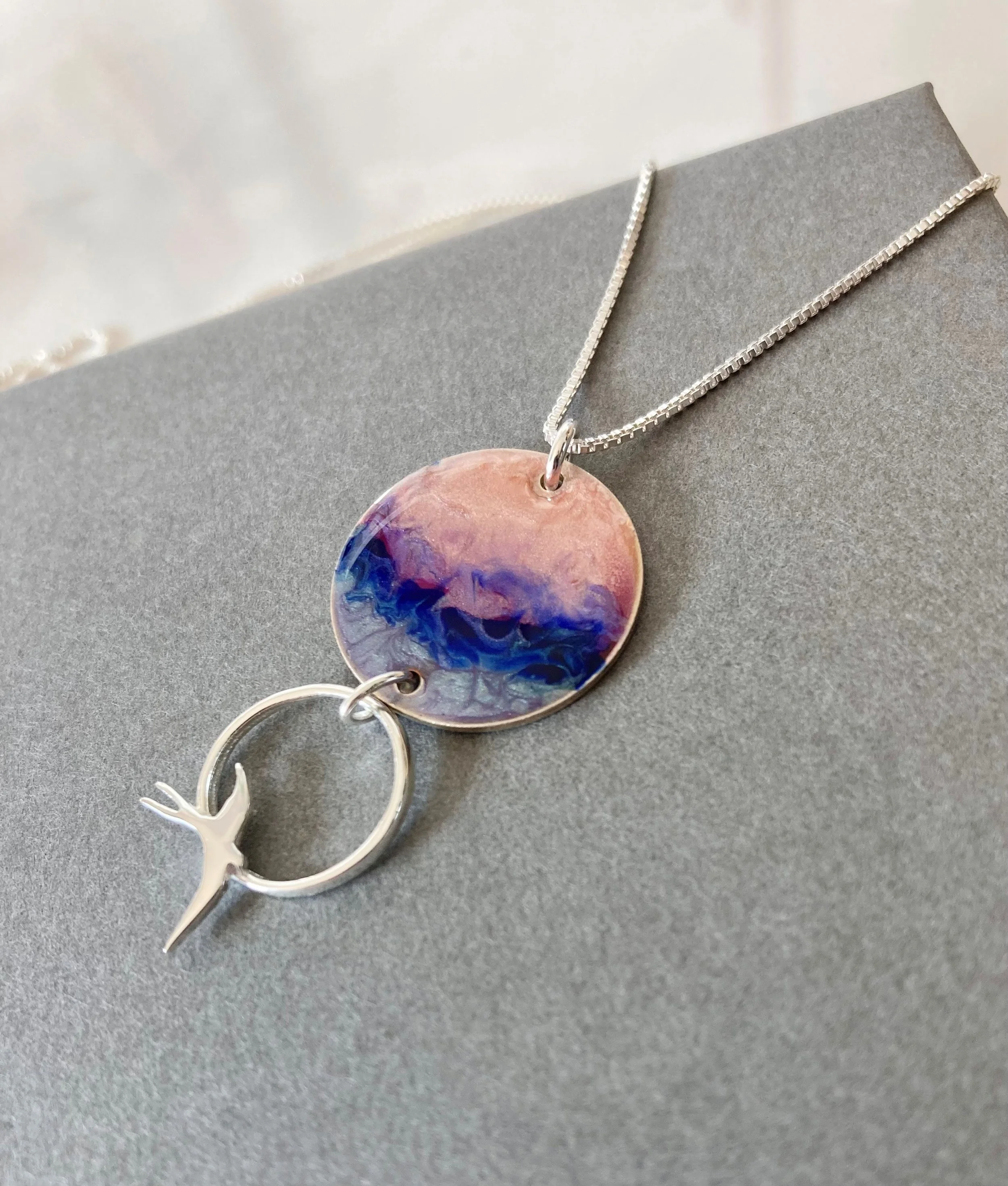
And no wonder when you see the magnificent sunsets above and below. This one taken on our first day and what became the inspiration for the Arran Flow jewellery collection.
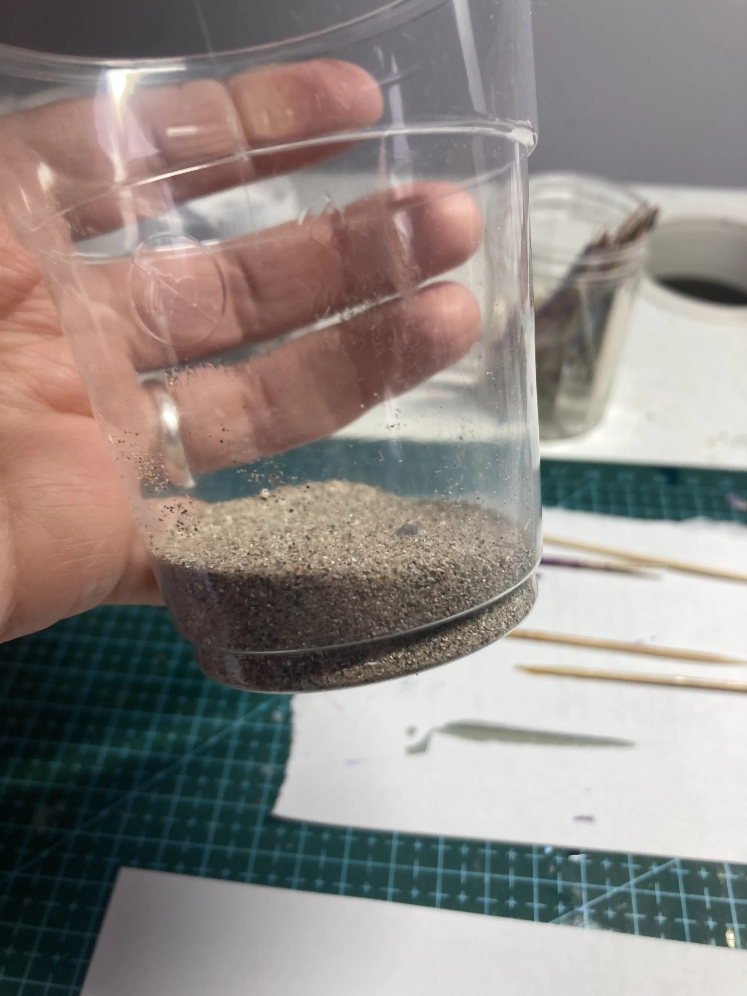
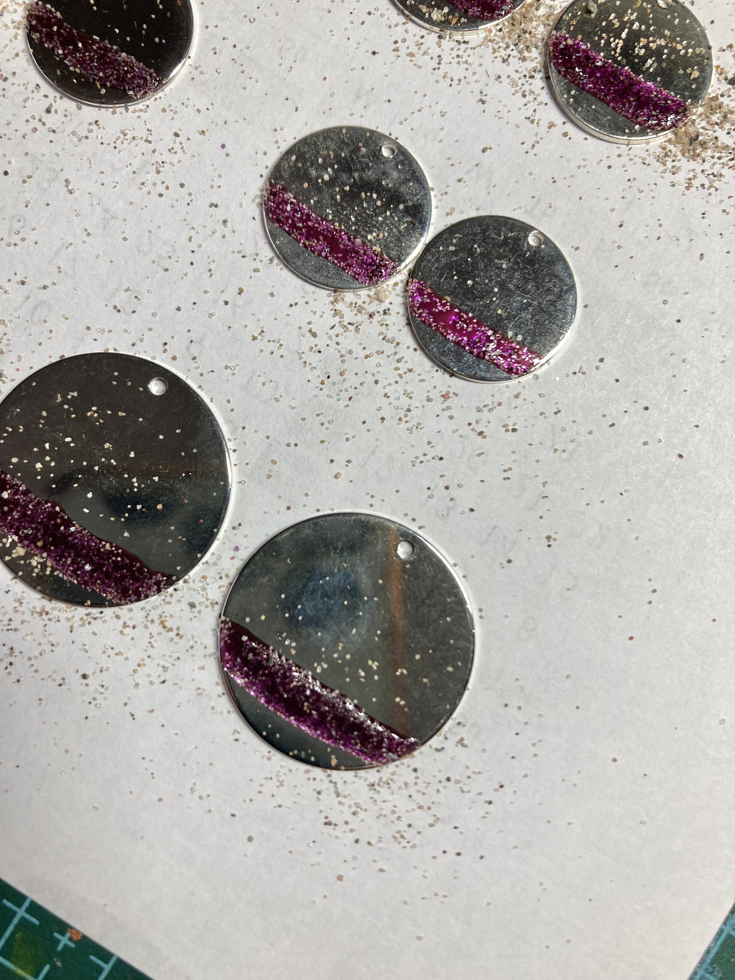
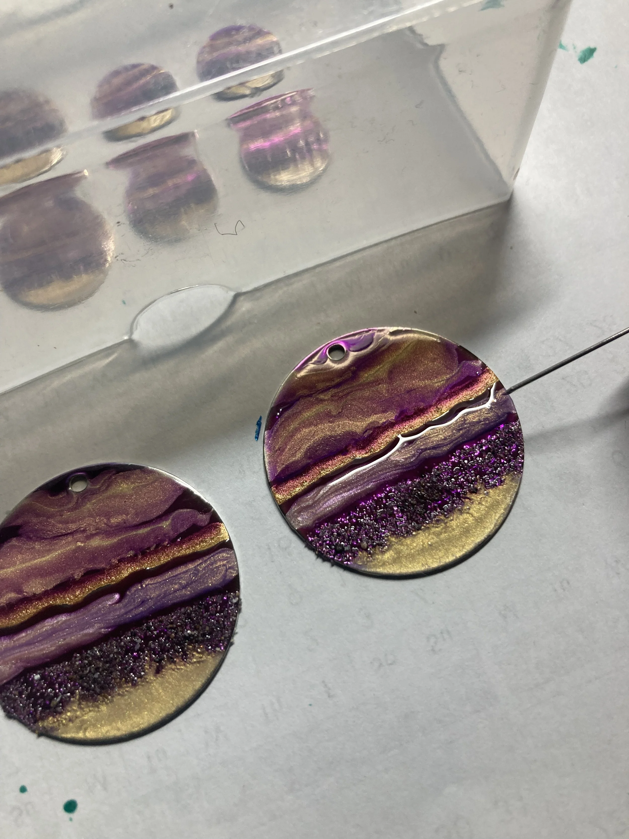
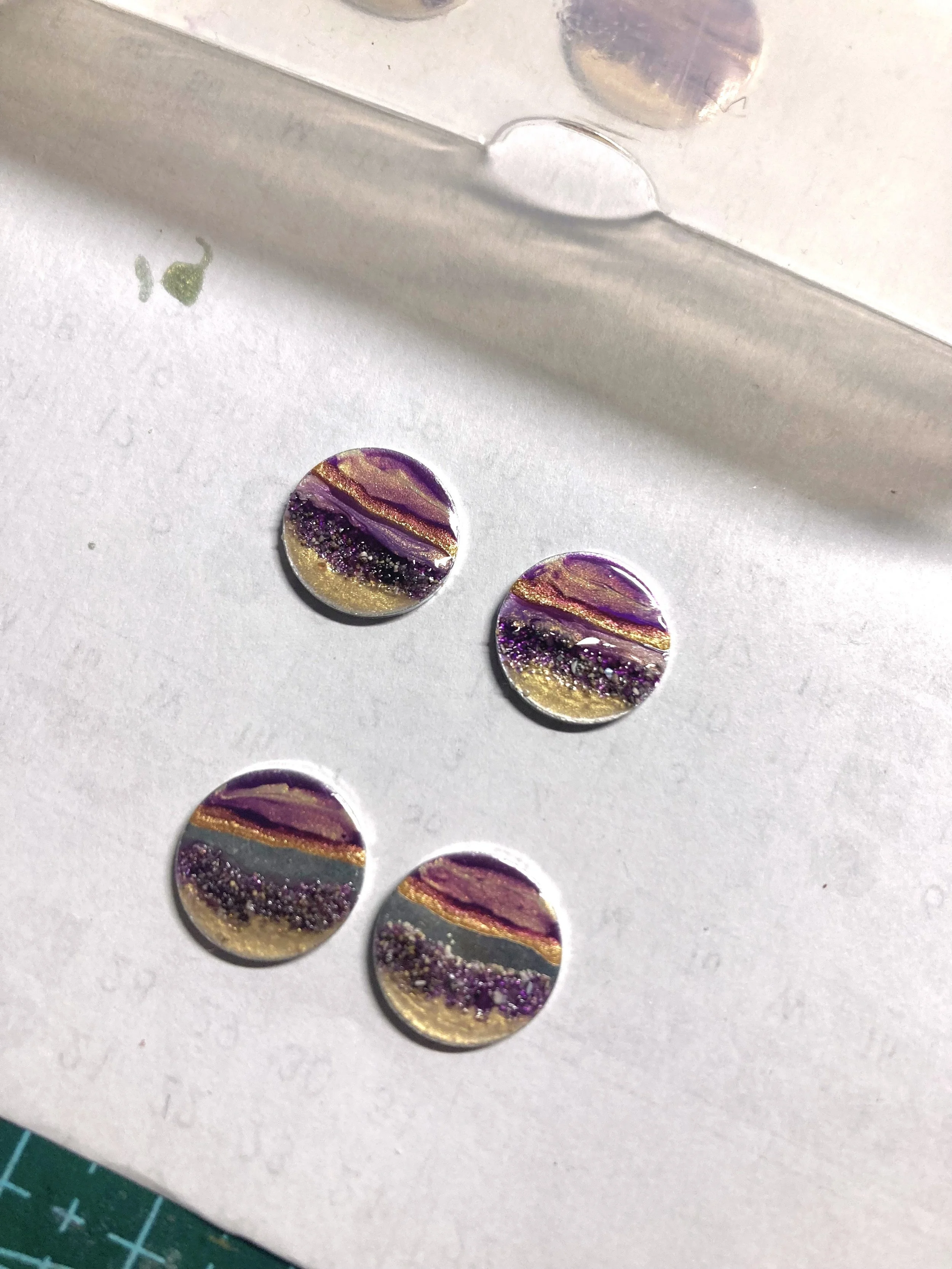
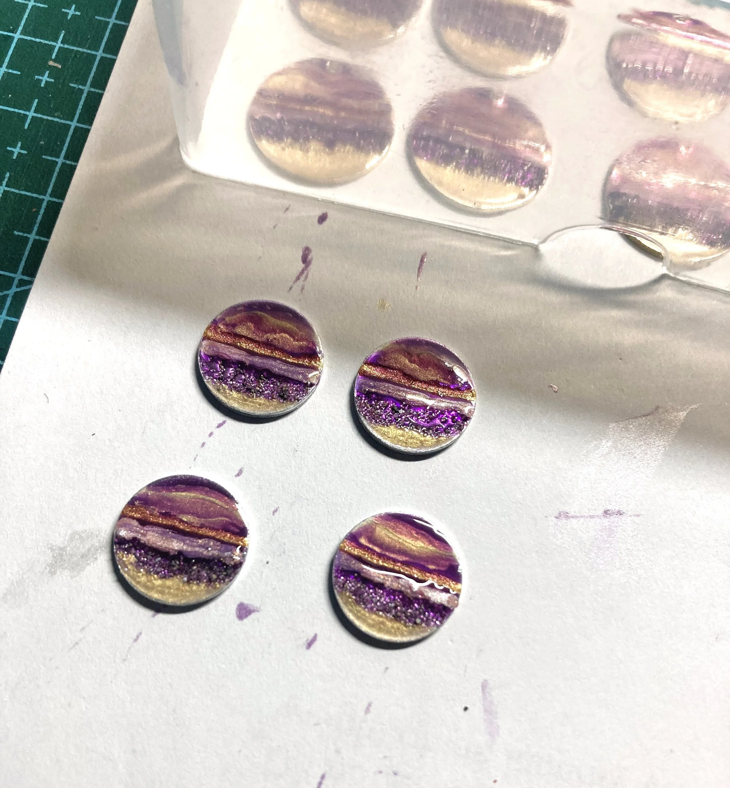
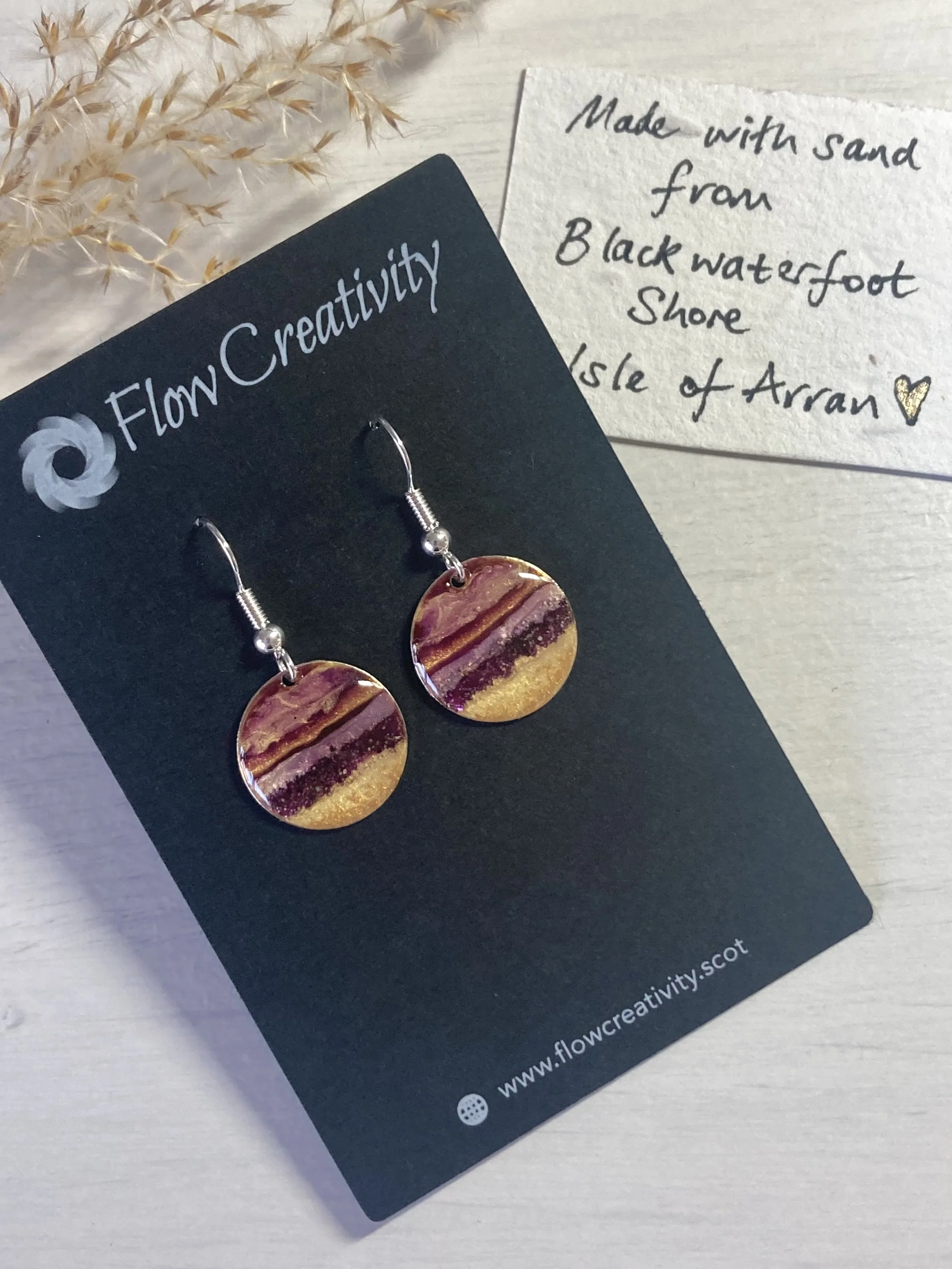
For a while I’d had a notion to do something with sand; not so much sand that was obviously sand; rather a way of bringing a new texture into my work. So before we left I scooped some sand from the shore pictured above into a little cup - and a little has gone a very long way indeed!
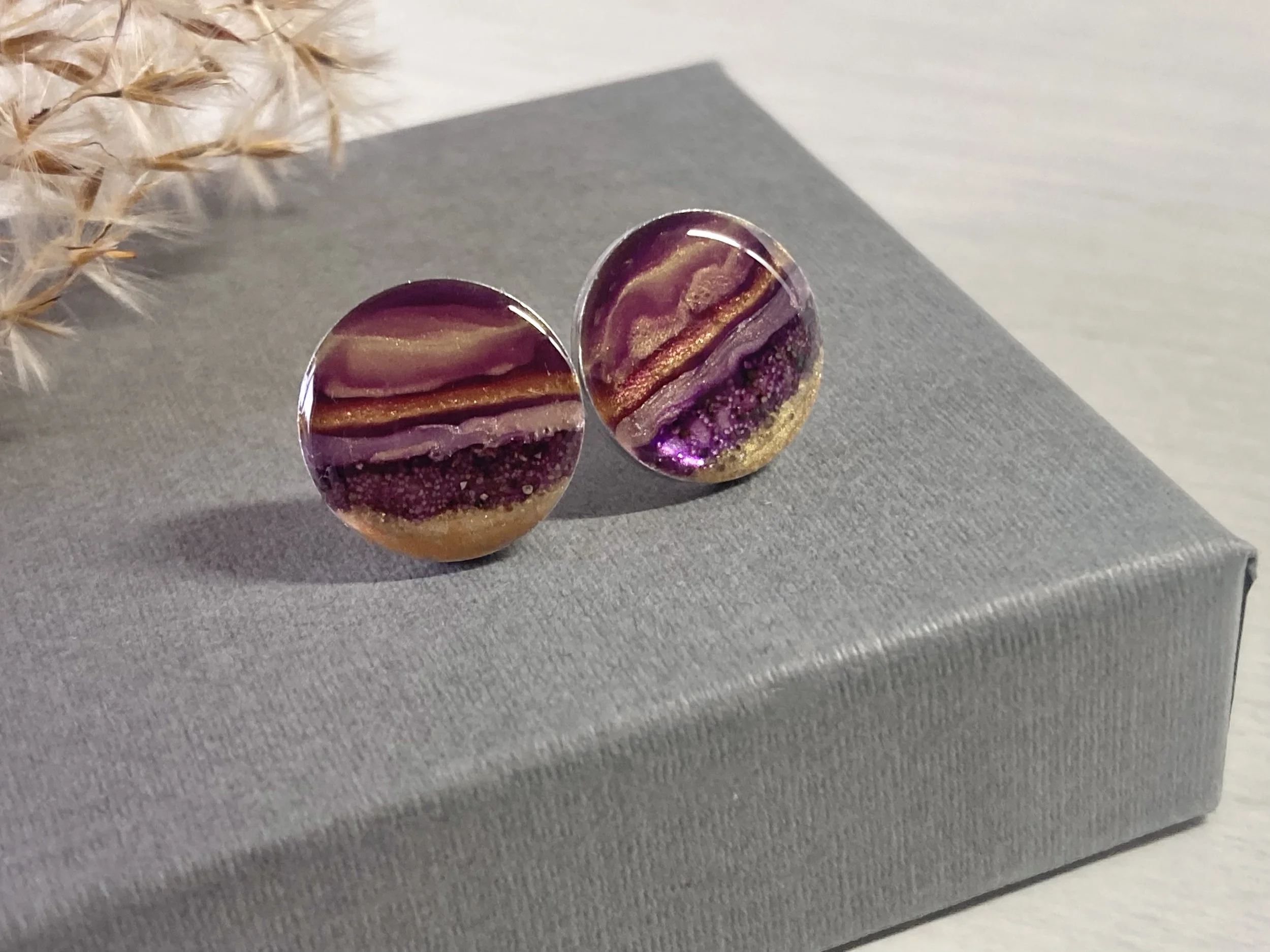
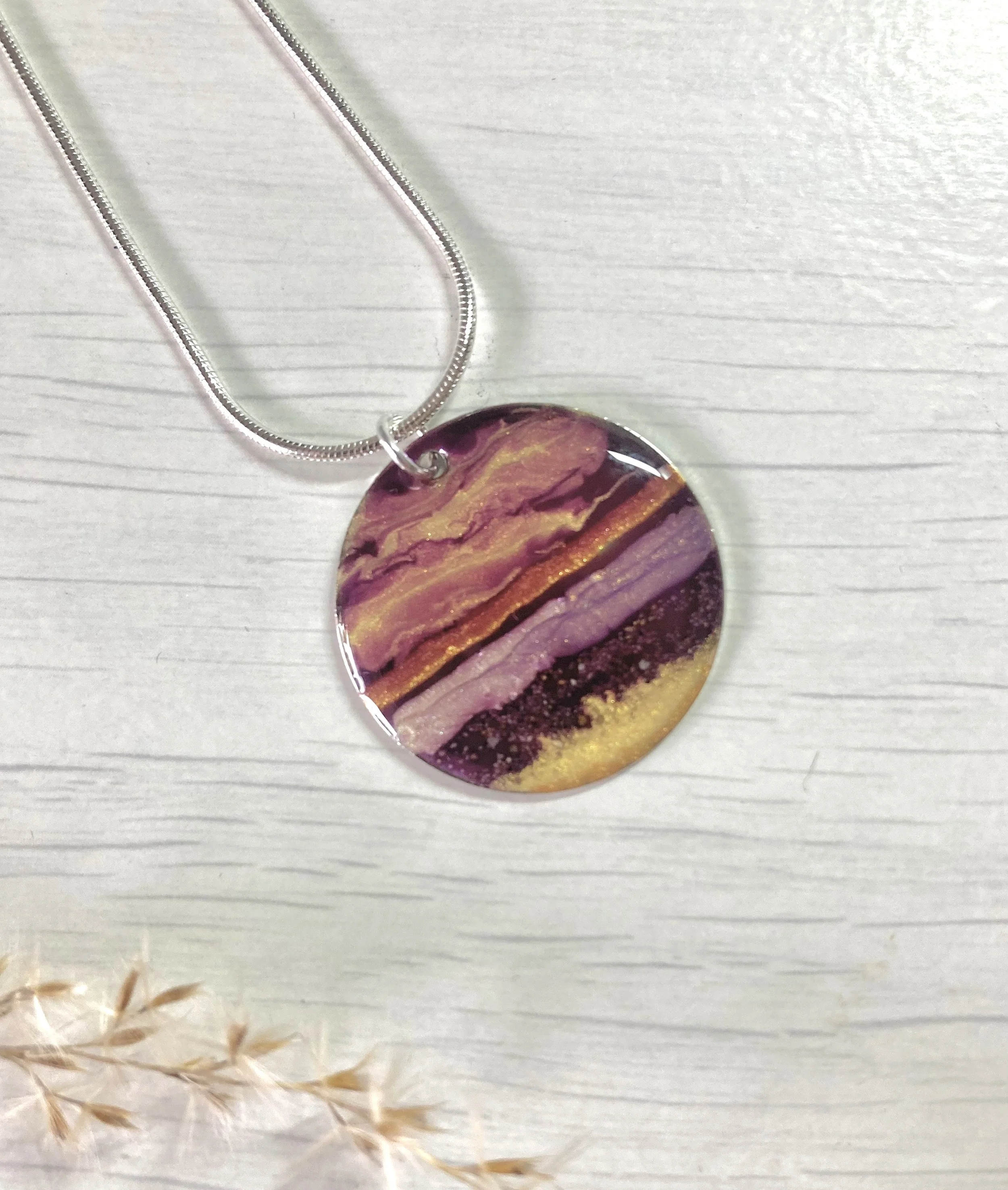
The sunset image drew me towards warm tones, but painted on silver metal rather than gold. I’m often asked if my designs on gold are available in silver, so it was a way of responding to this too.
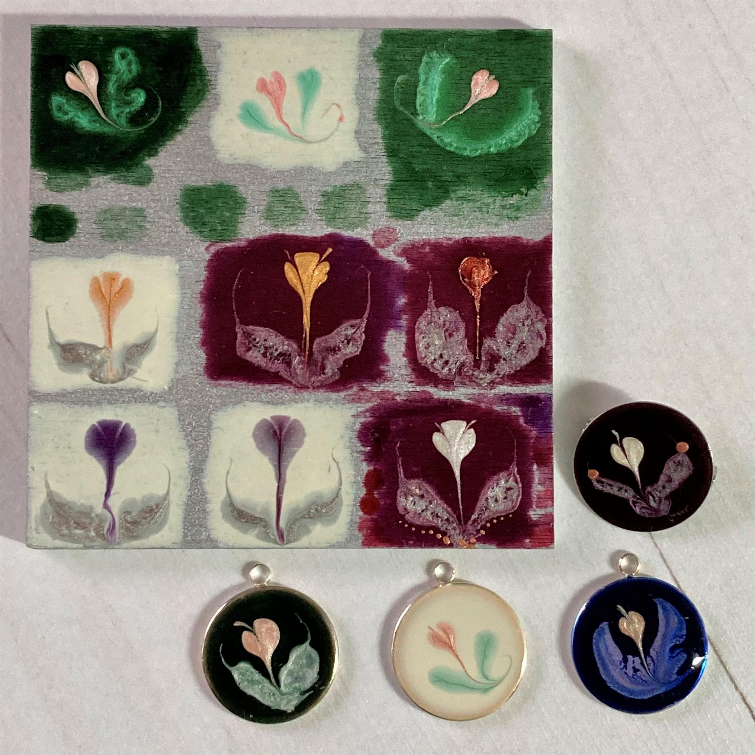
There were various experiments and you can see earlier iterations in a previous Blog about Samples (scroll down after reading this)
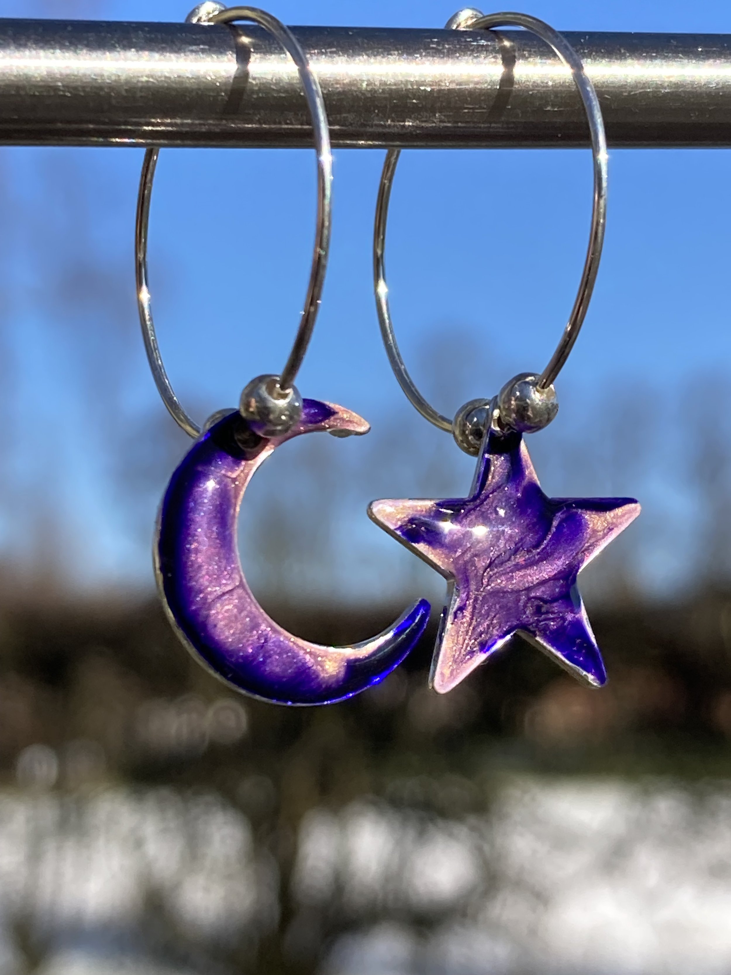
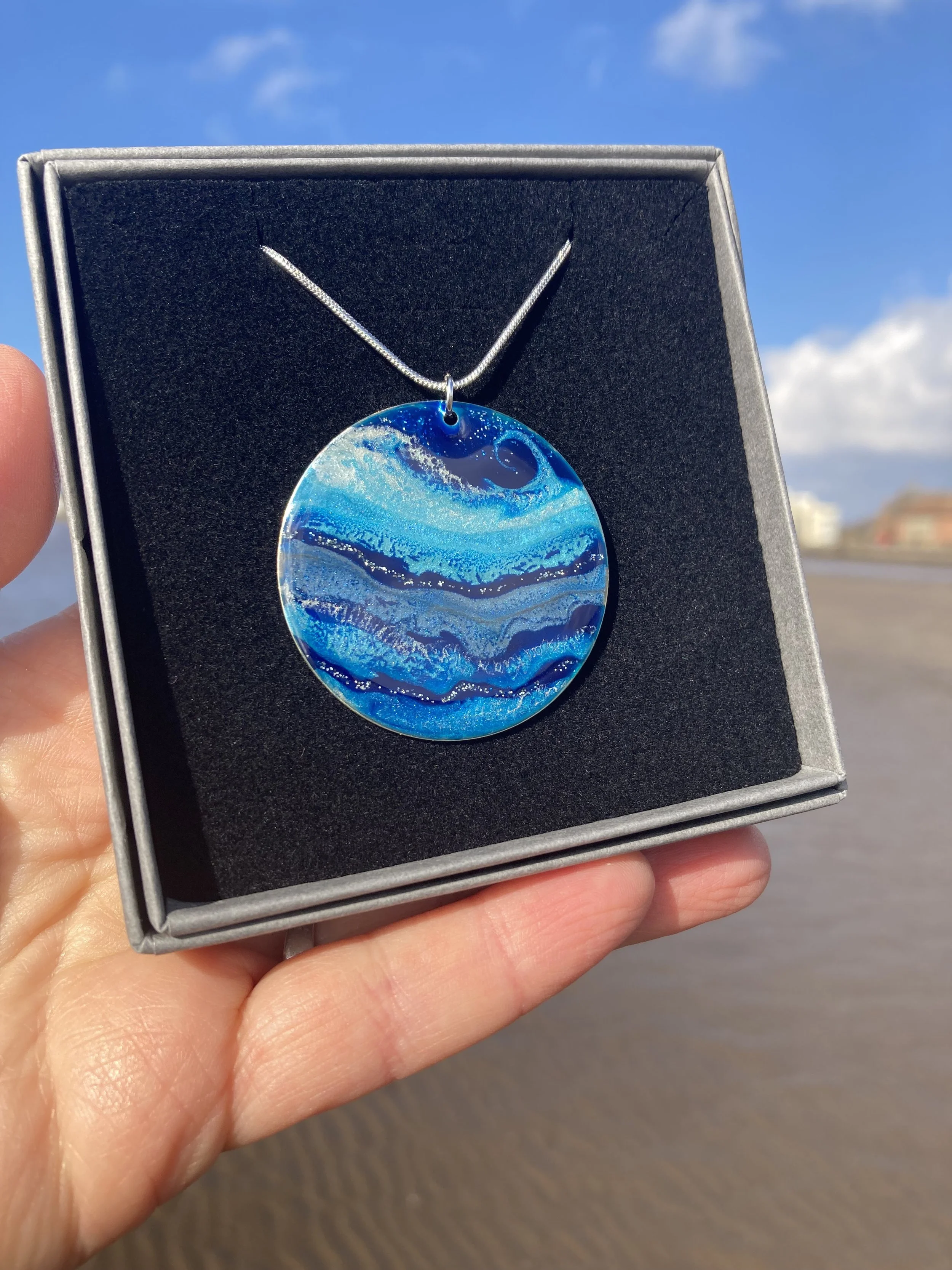
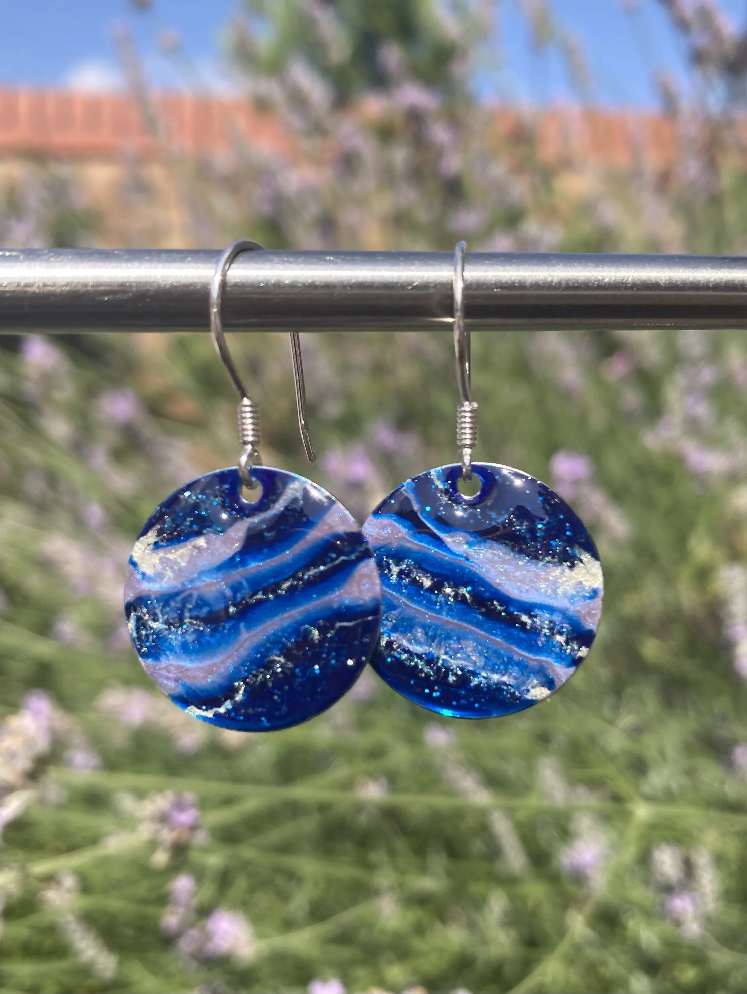
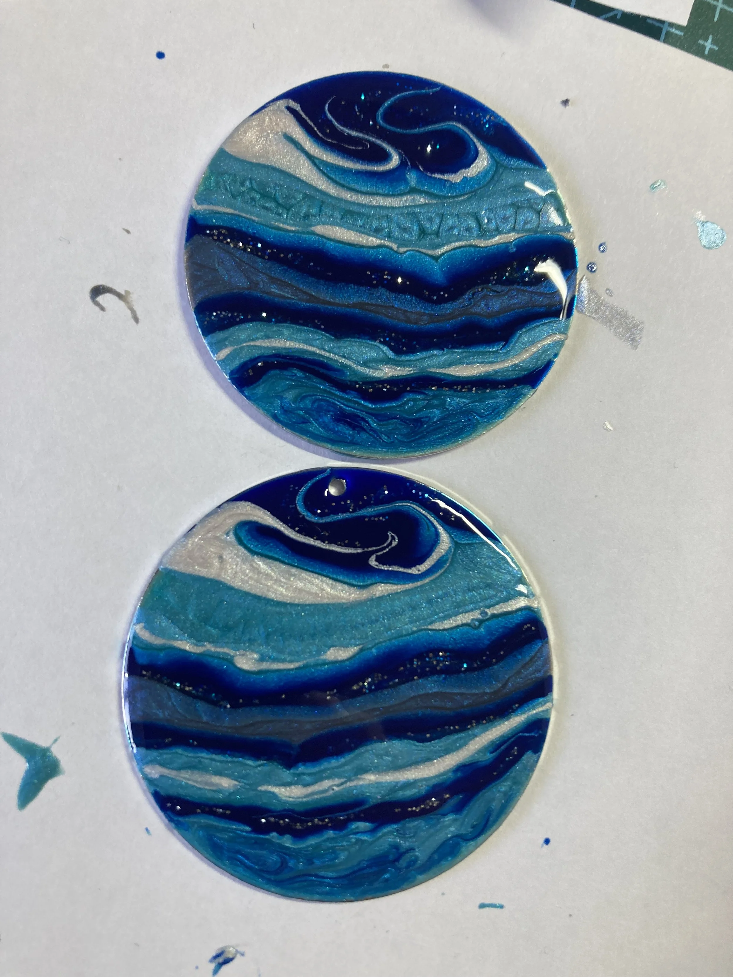
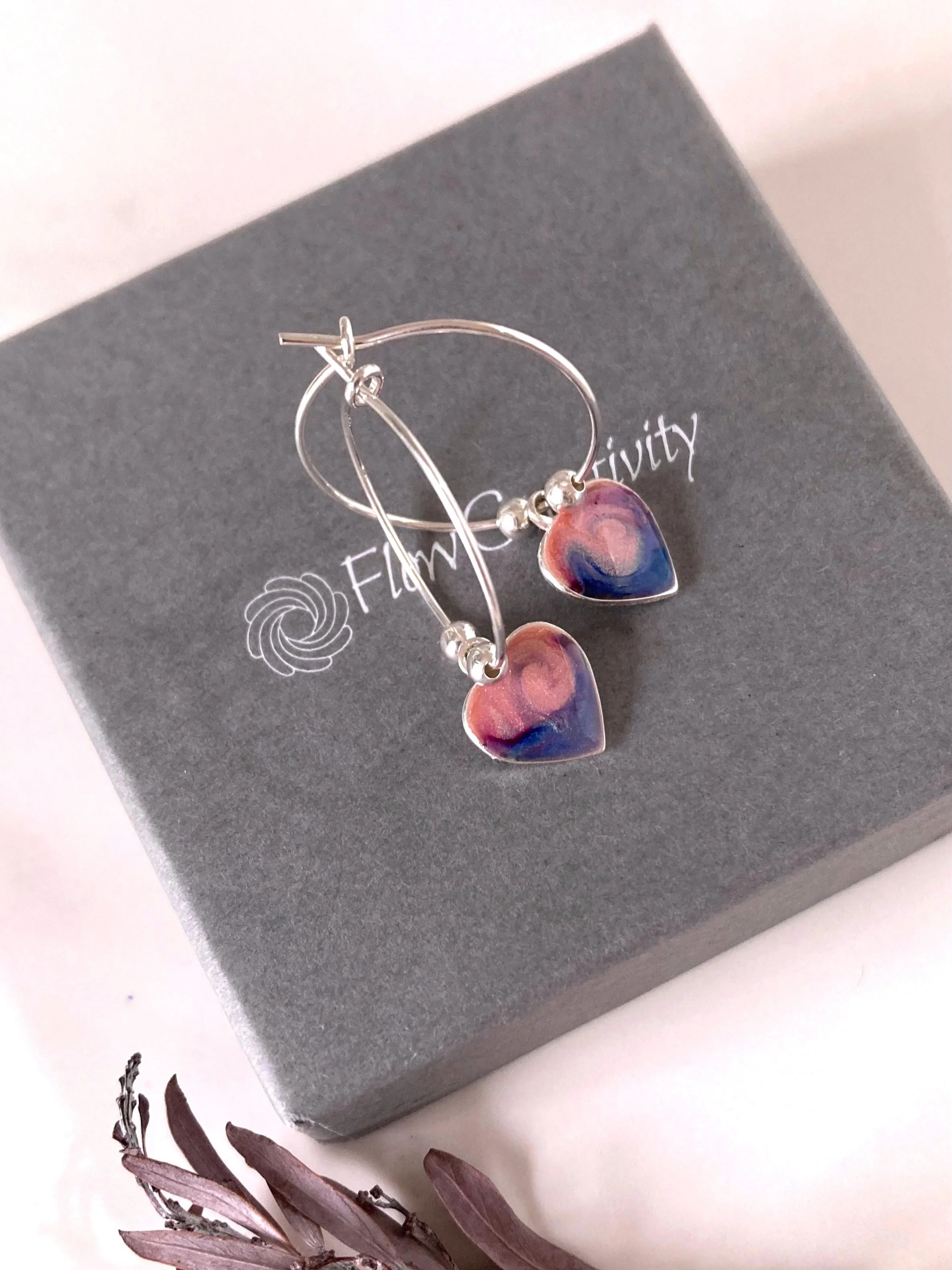
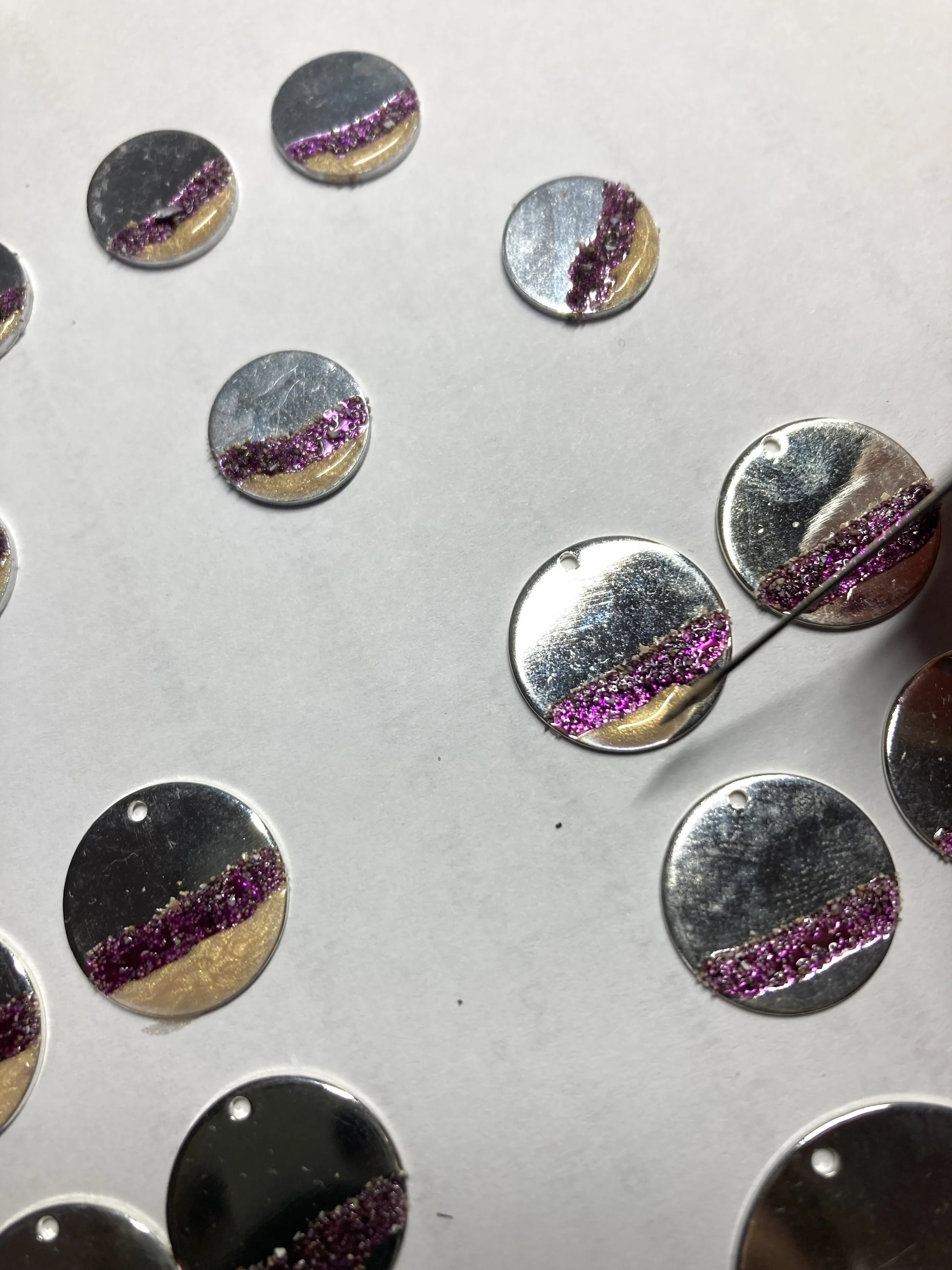
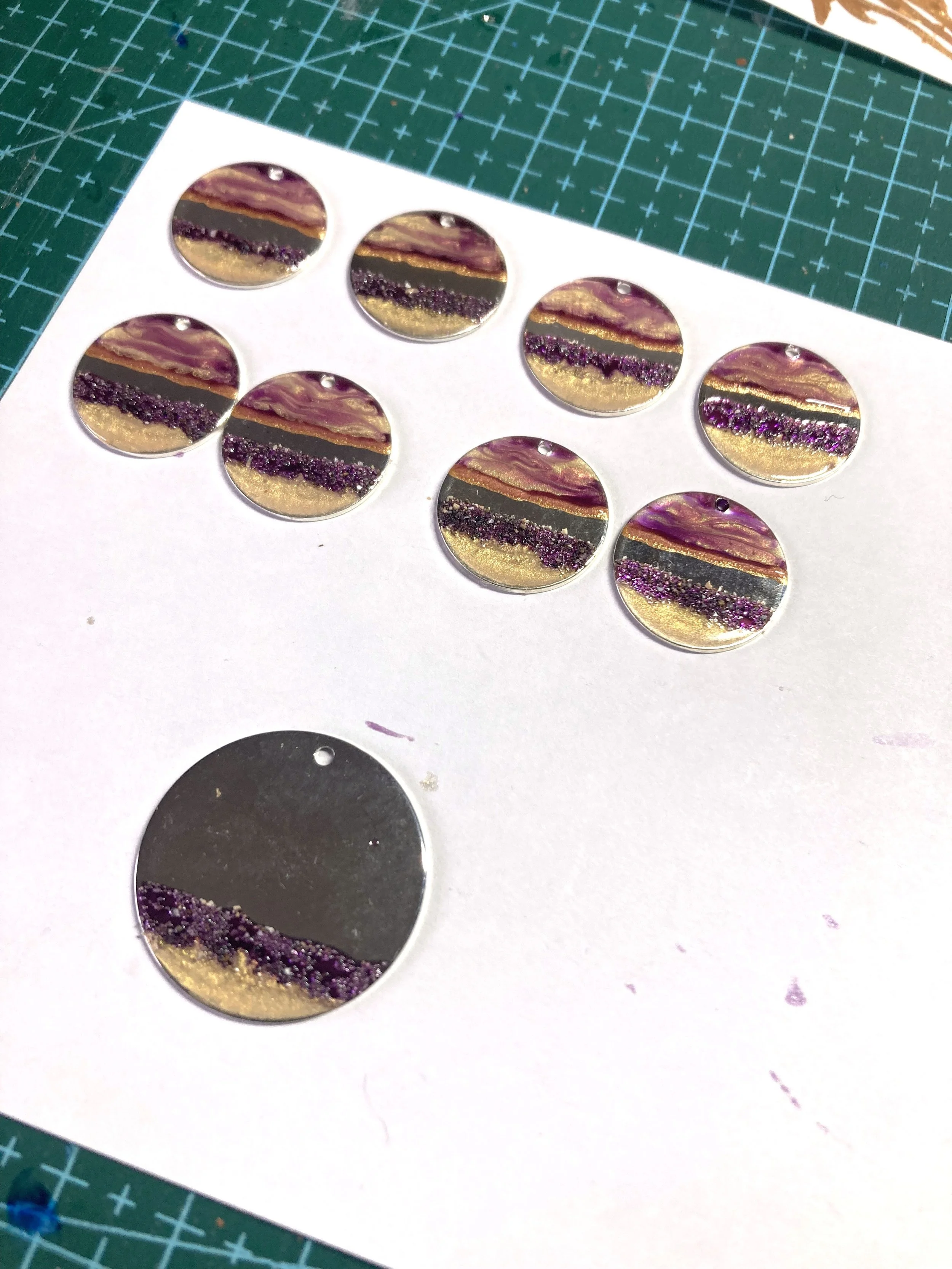
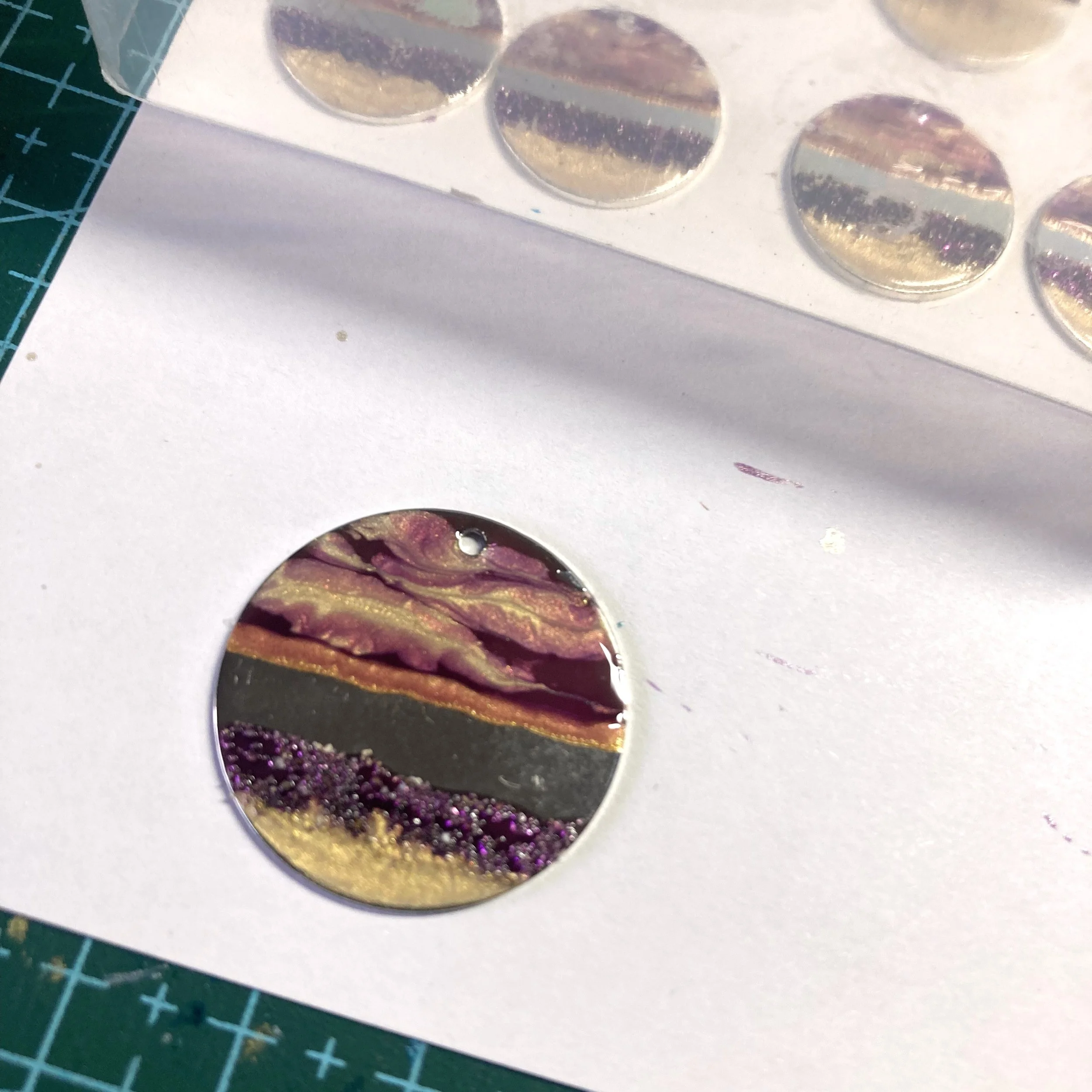
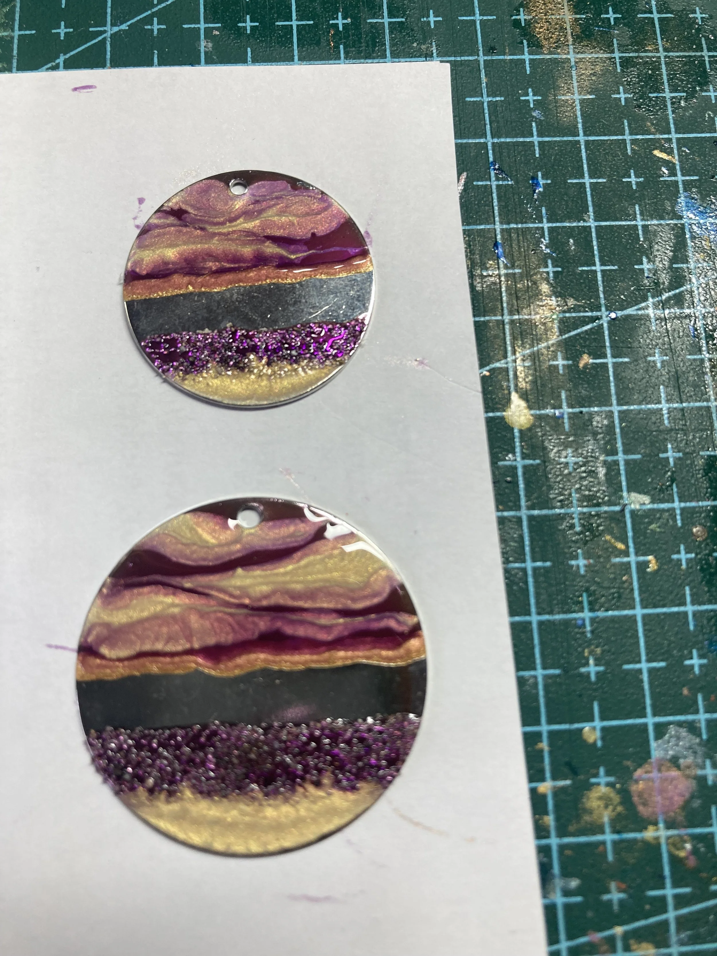
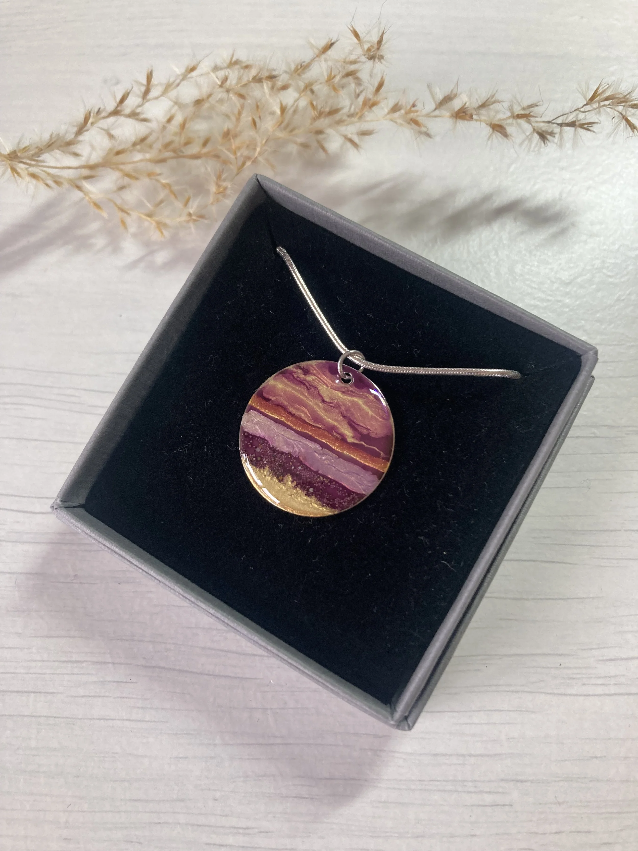
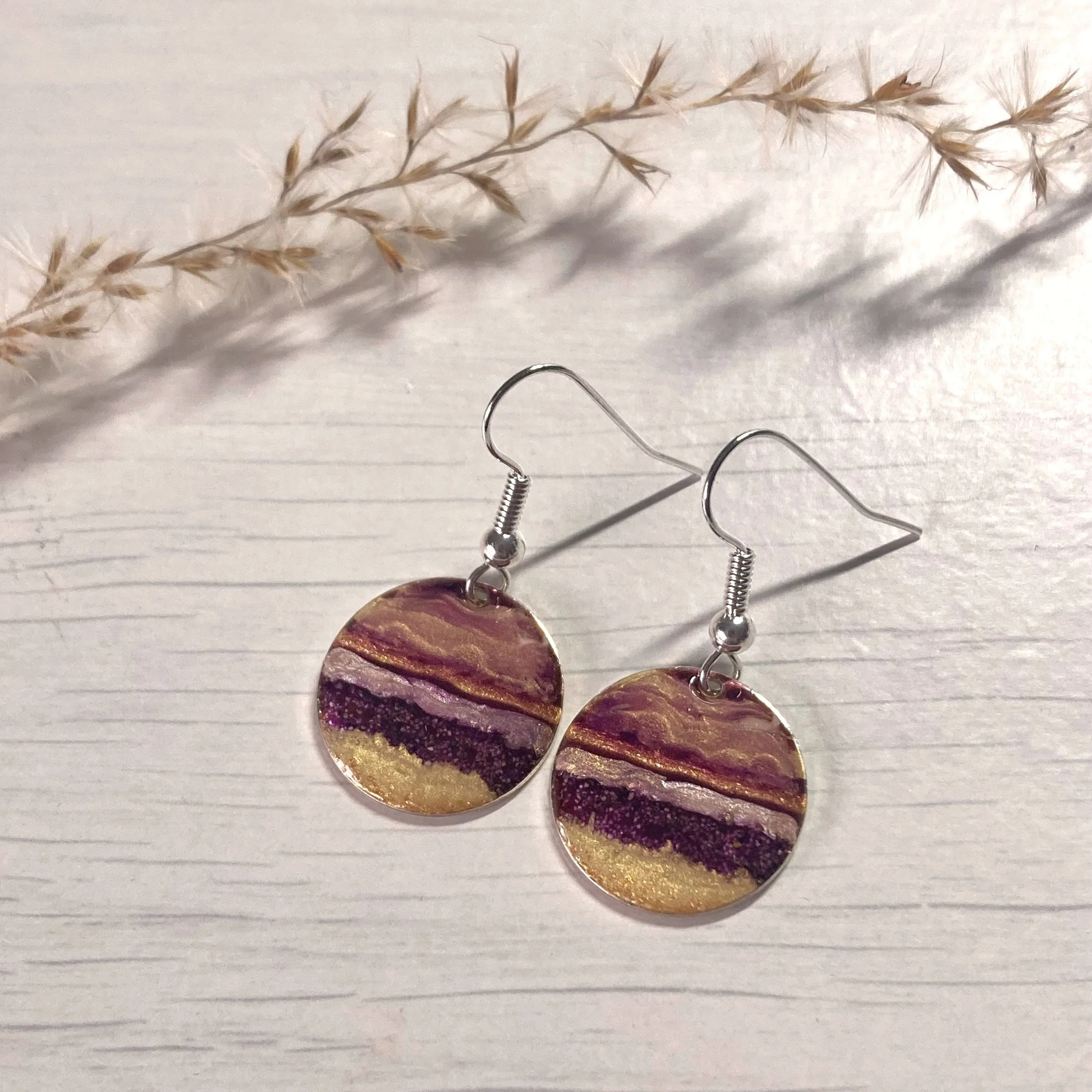
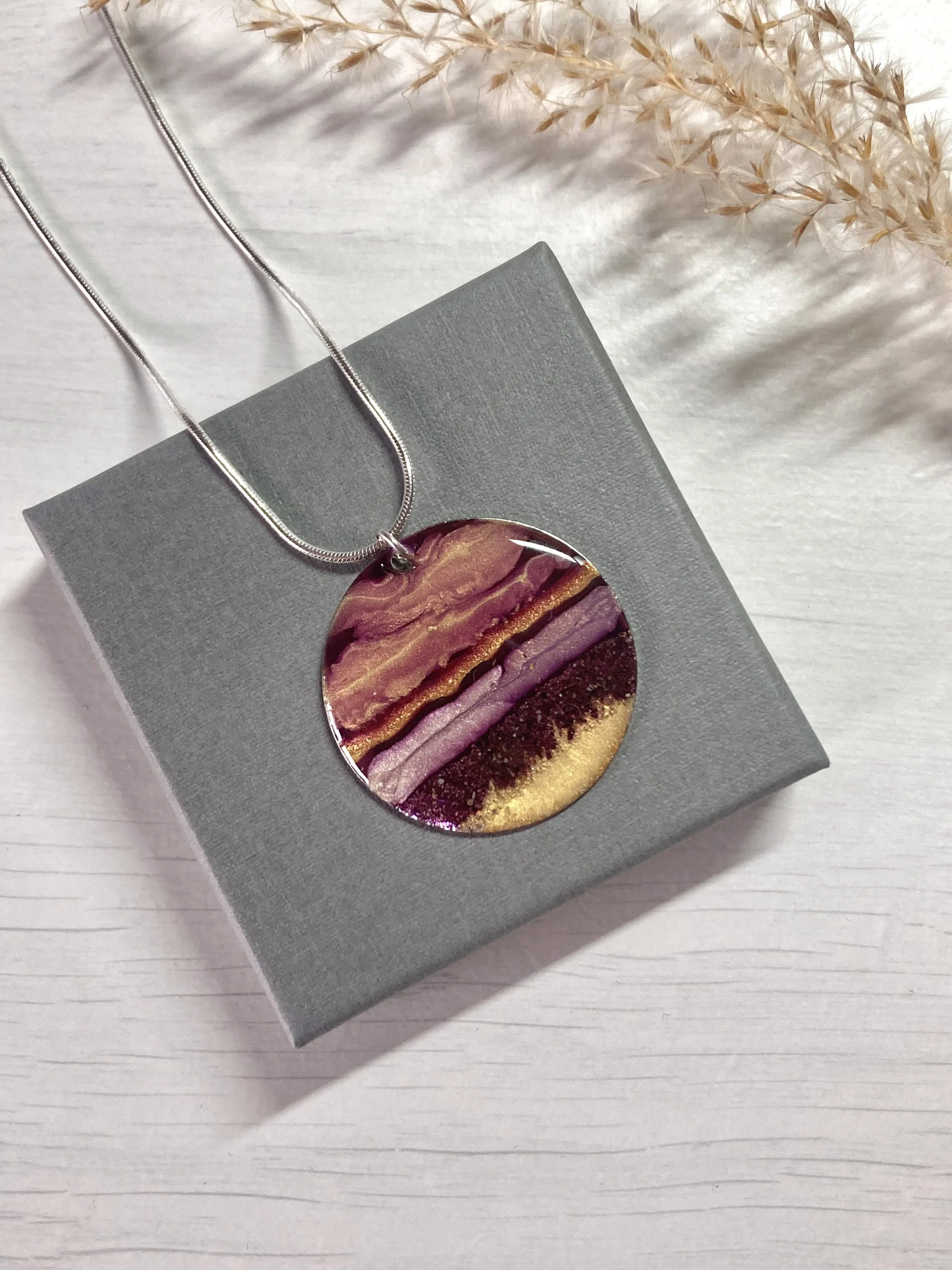
The design settled into a form of what has recently become my signature style; layered up paints in contrasting colours. with gorgeous soft mauves, pinks and golds - looking at it invites you to enter into a relaxed state, reconnecting with your own memories of the places dear to your heart.
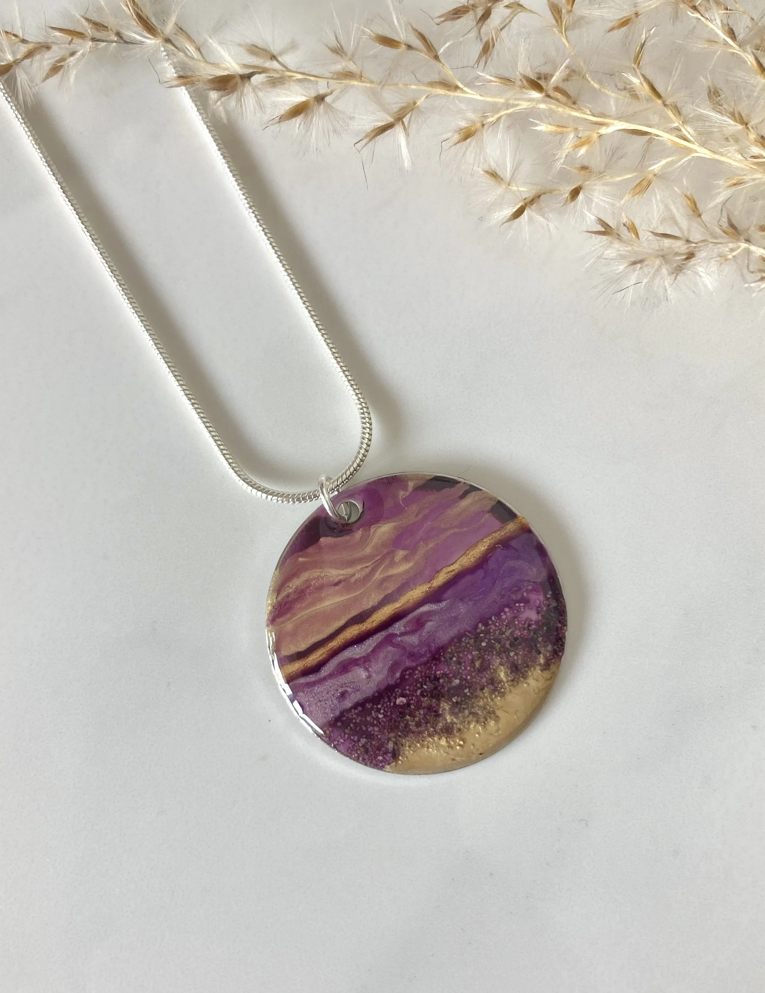
You can see the texture of the sand blended into the mauve with the gold seeping in, then the lovely sense of movement of the skies above the sea - with the gold line representing that bright line of horizon light I just love looking at.
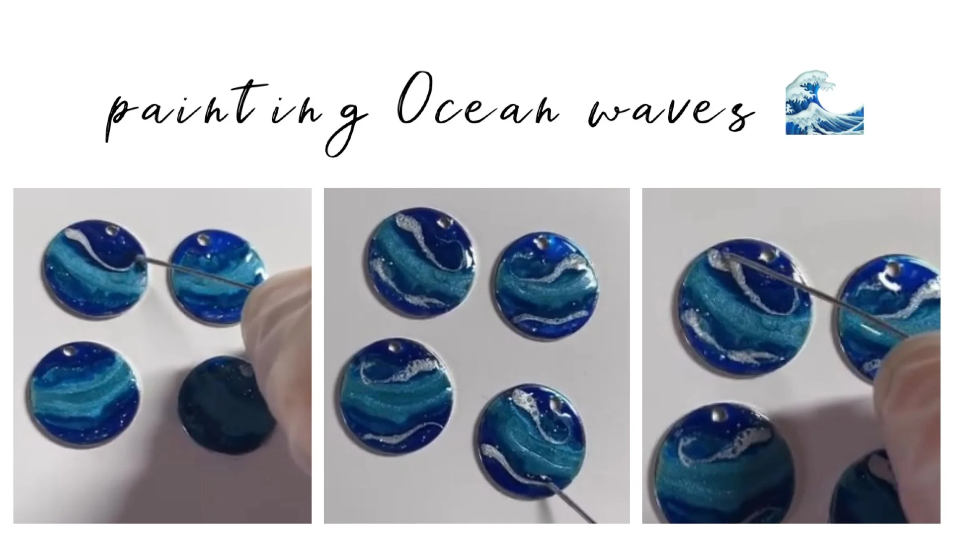
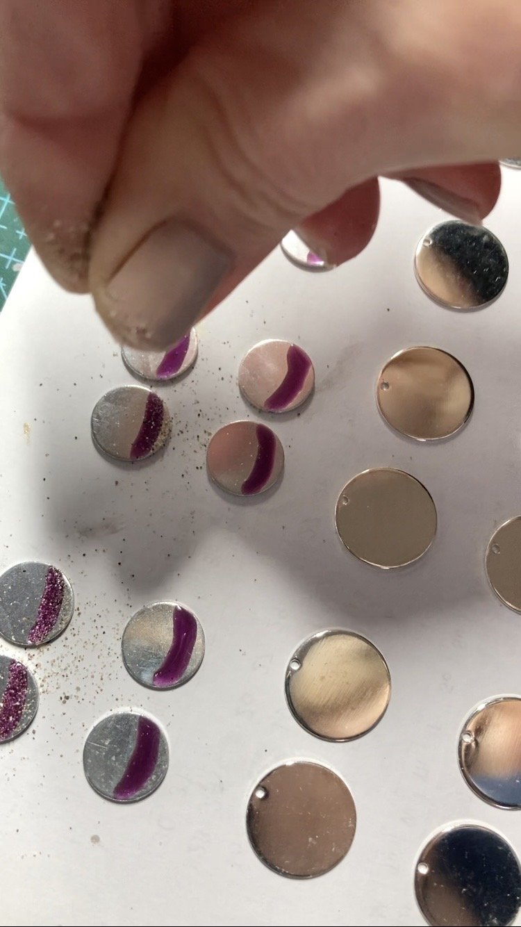
So how is it made? watch this image sequence here to see the stages; I learned early on that the sand needed to be applied to a band of paint first with time to settle, so you can see how the paint is applied in stages:
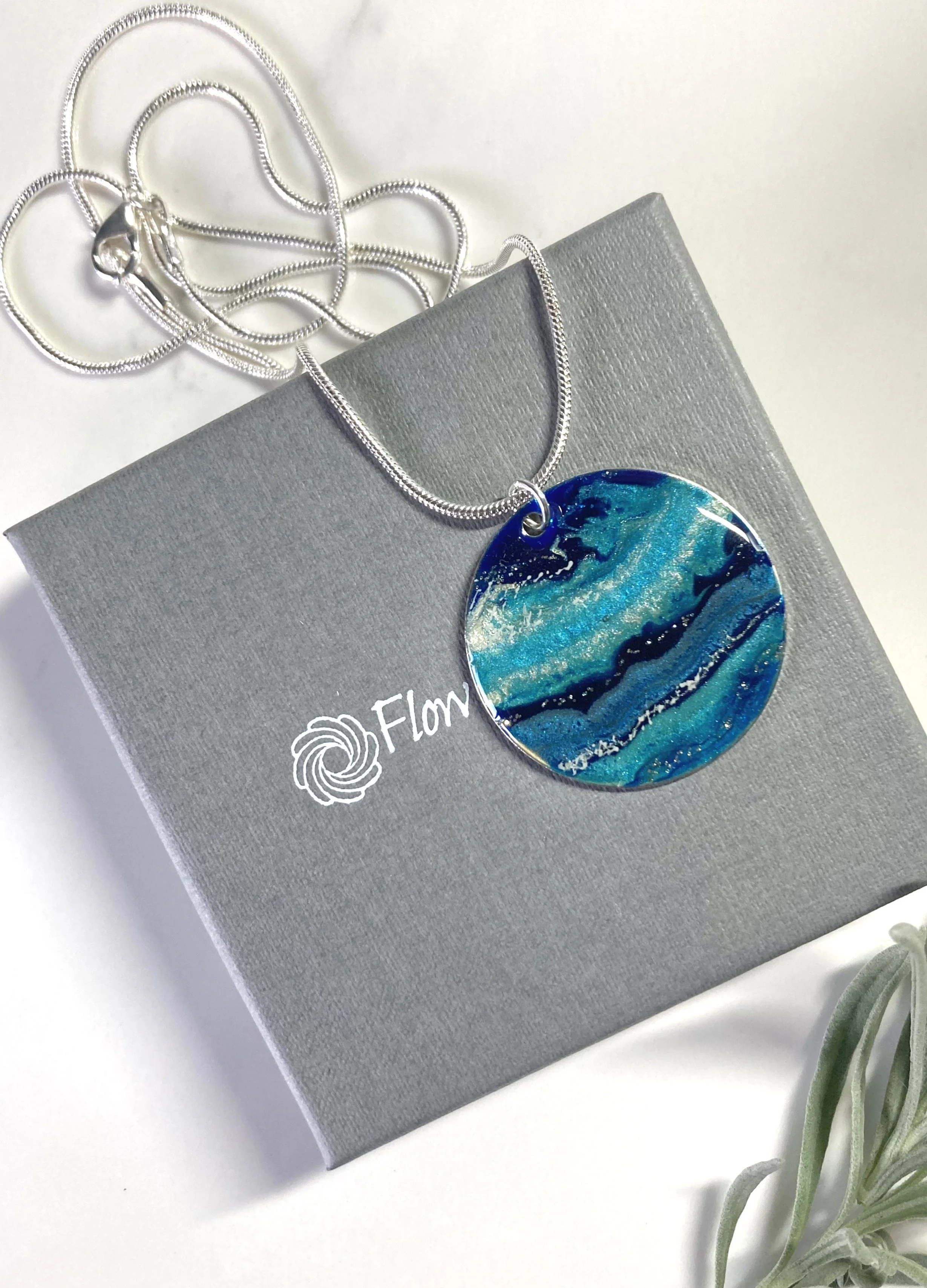
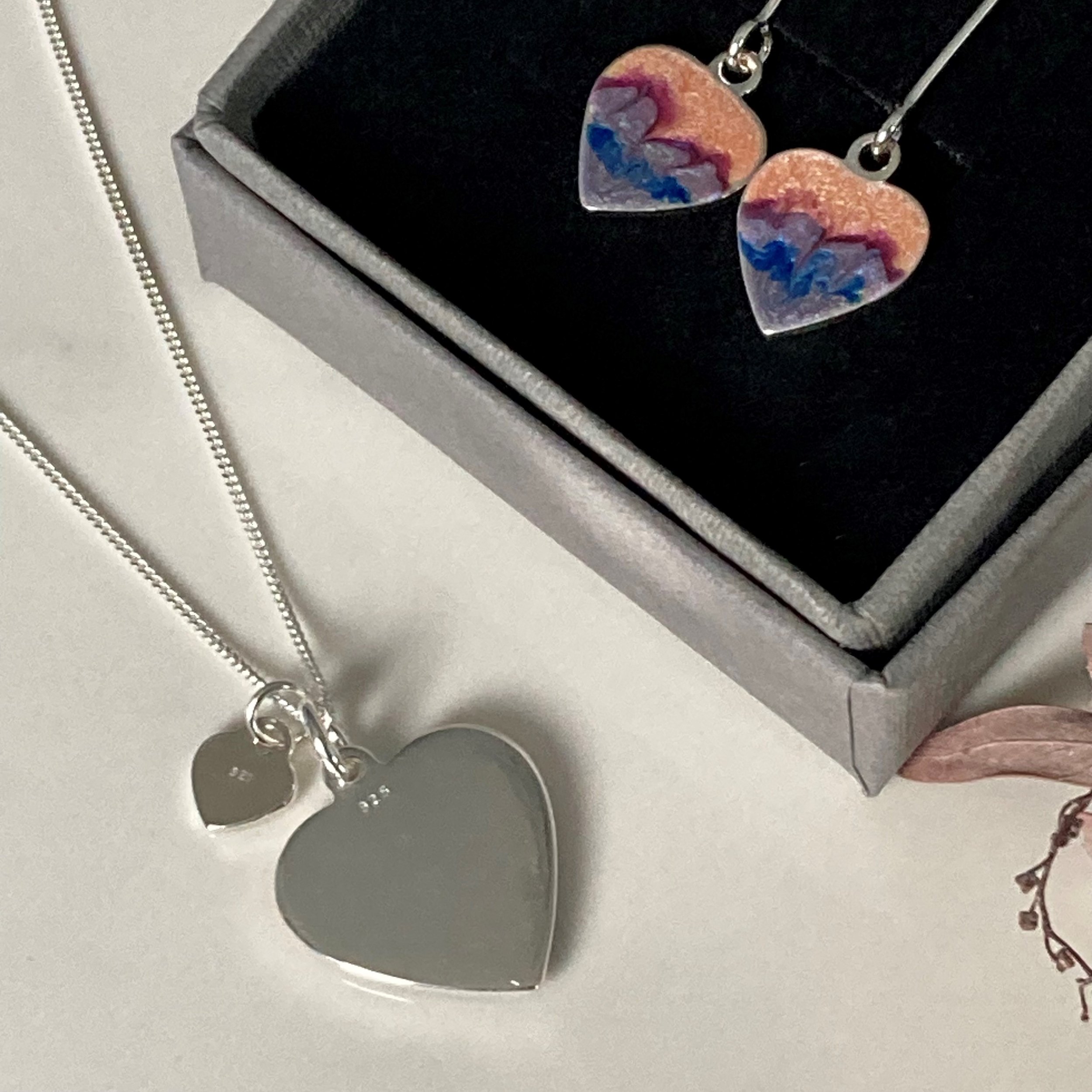
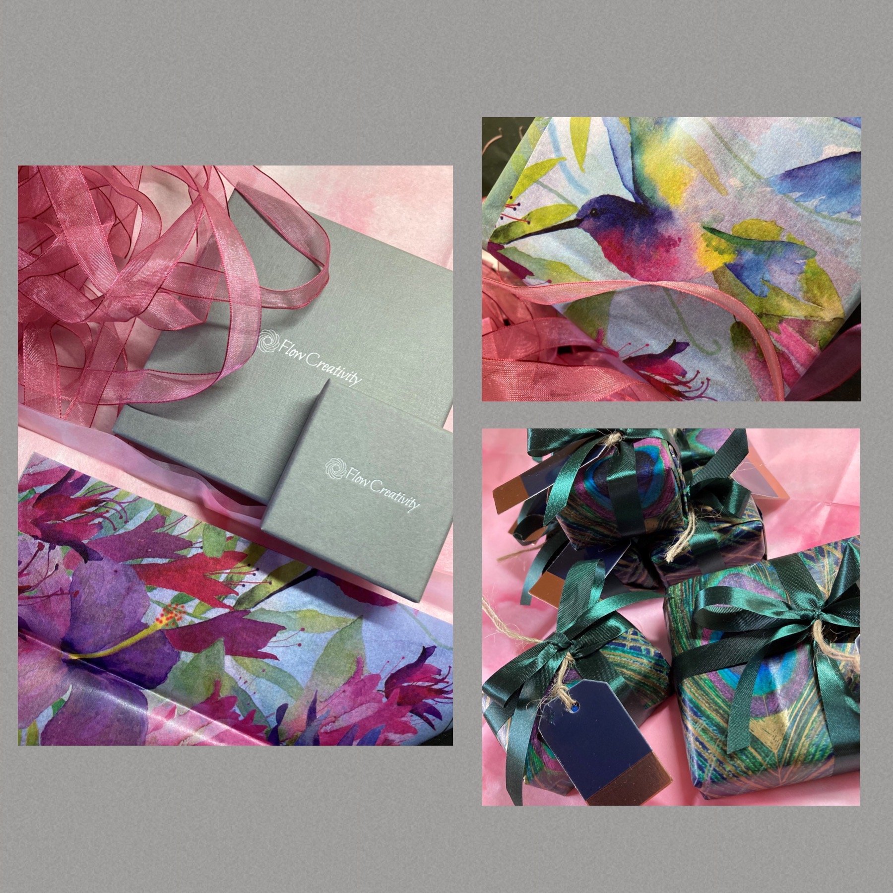
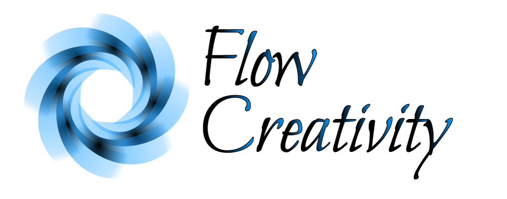
One important learning point from Christmas markets was buyers requesting a little card to describe the origins of the jewellery, so I found myself quicky writing a card to include with the gift. I’ve now made little cards to be included with every purchase. For pendants the card will be tucked inside the lovely mauve ribbon so it’s visible on the outside of the box. The cards are full of texture too; handmade paper containing plantable seeds - either a keepsake or a way of growing something else from your gift.
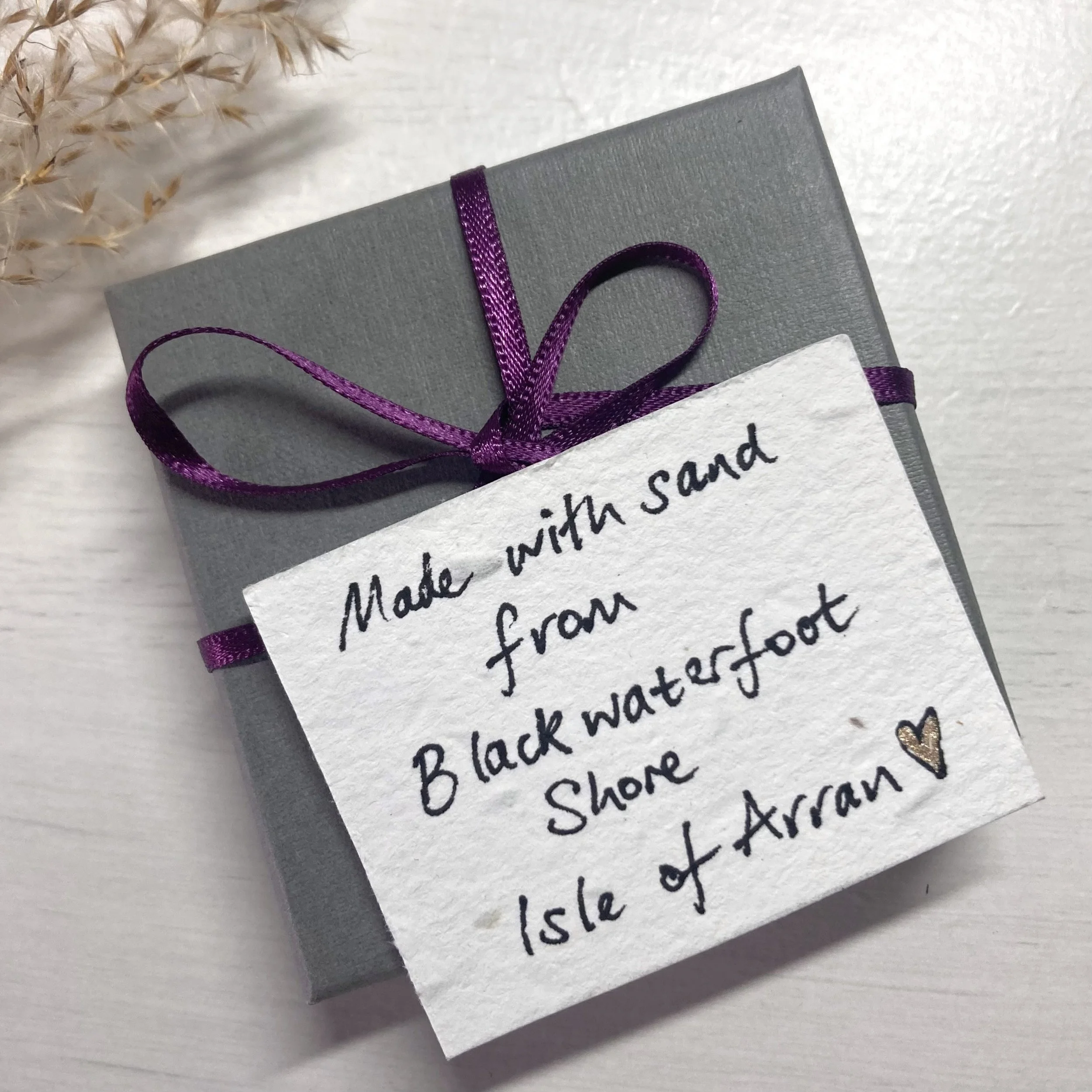
This really helps bring out the emotional connection with the jewellery before even opening the box!
Then on opening the box, the sight of the sunset bringing you straight to your very own Arran nostaglia!
Like my other designs, it’s so special to know that people feel an emotional connection to their chosen or gifted jewellery. The act of putting on your pendant or popping in your earrings, brings you that heartfelt moment of connection.
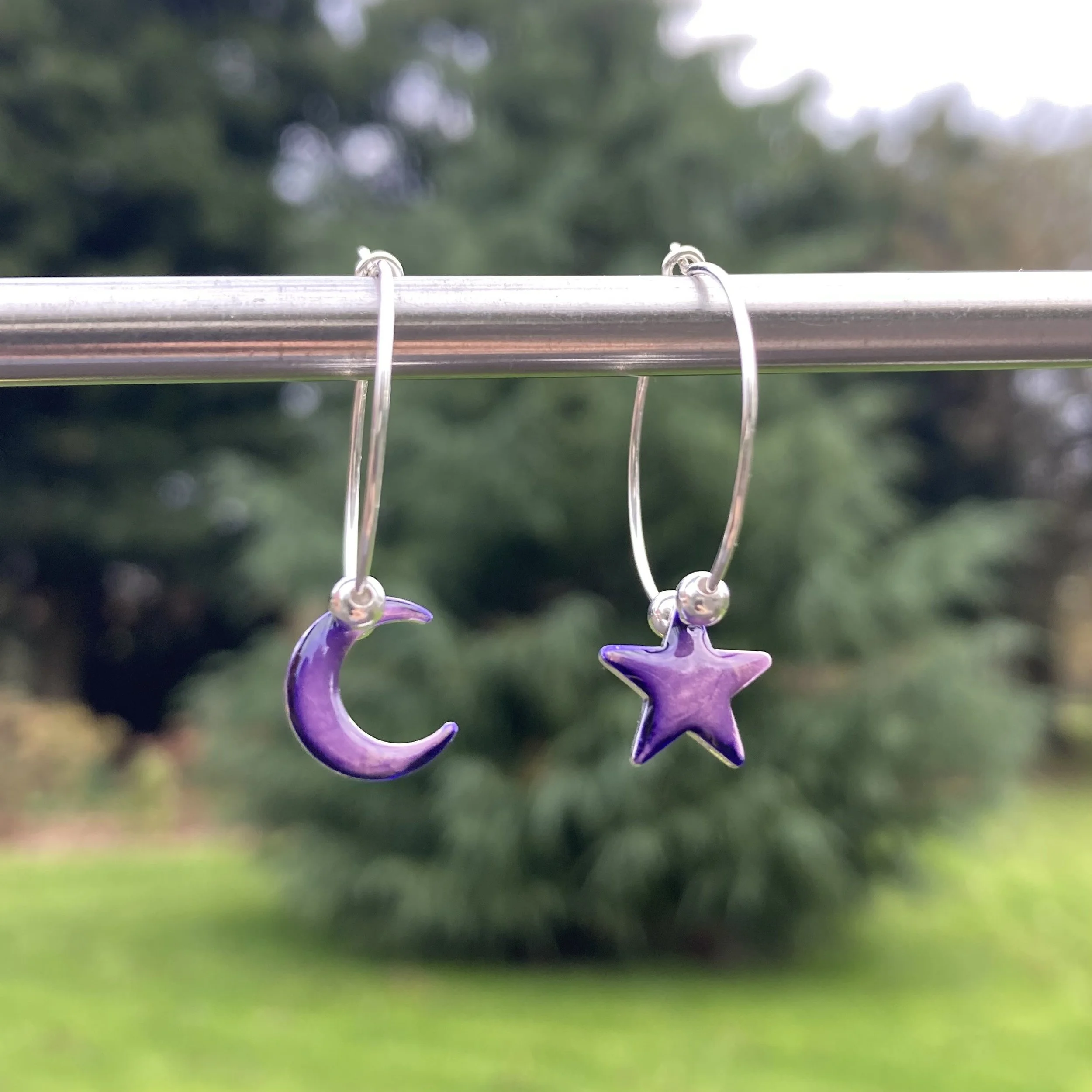
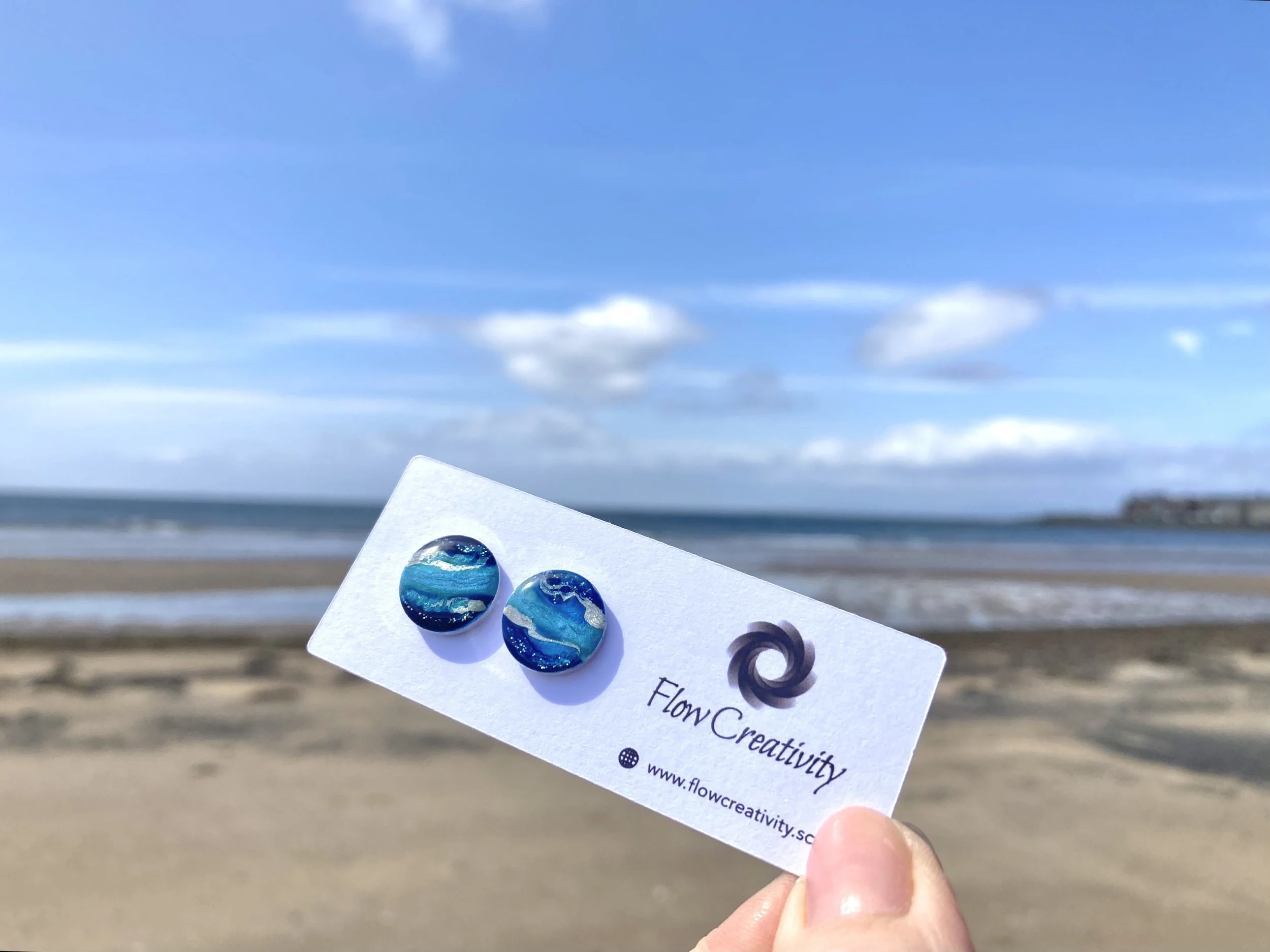
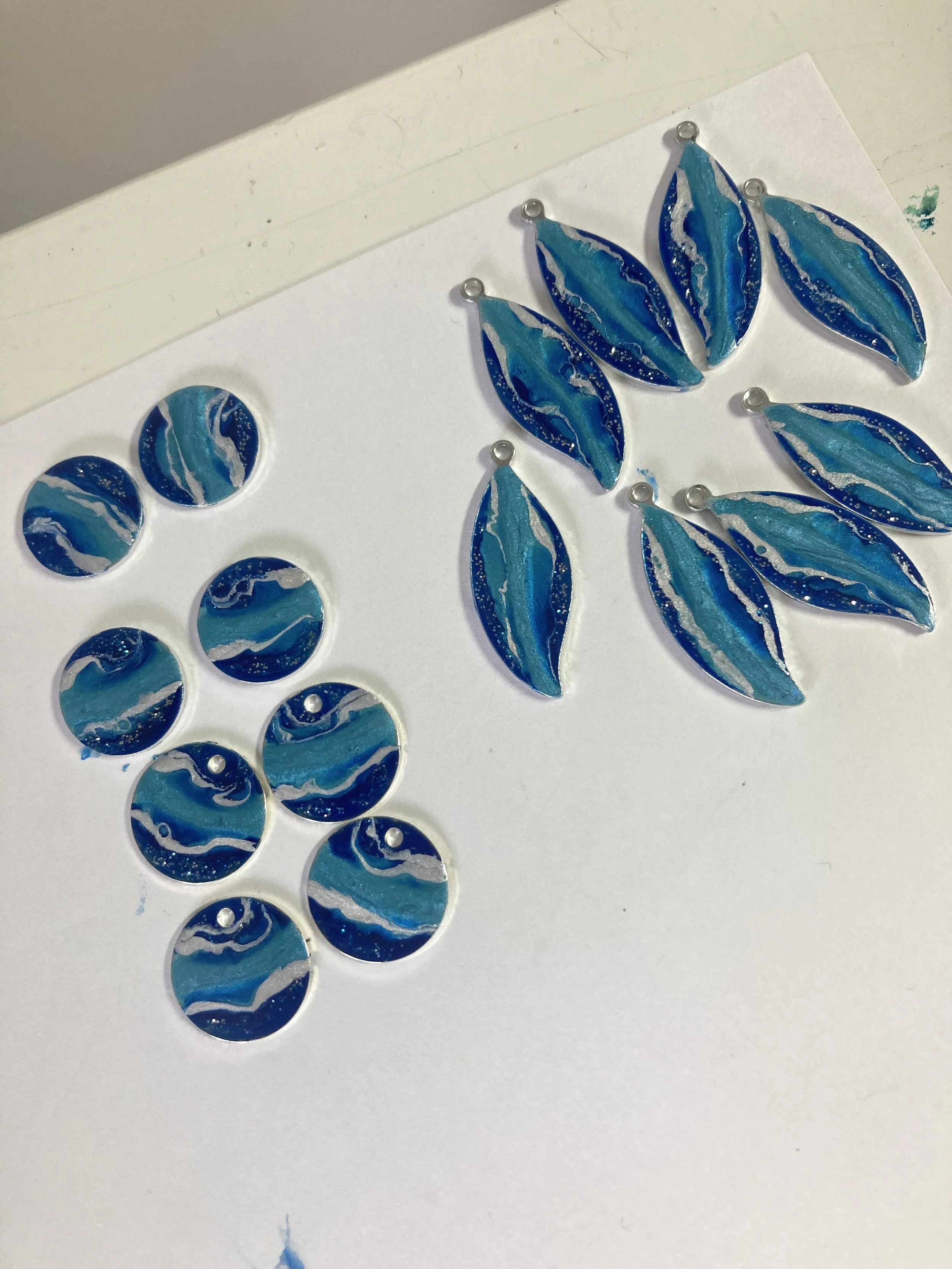
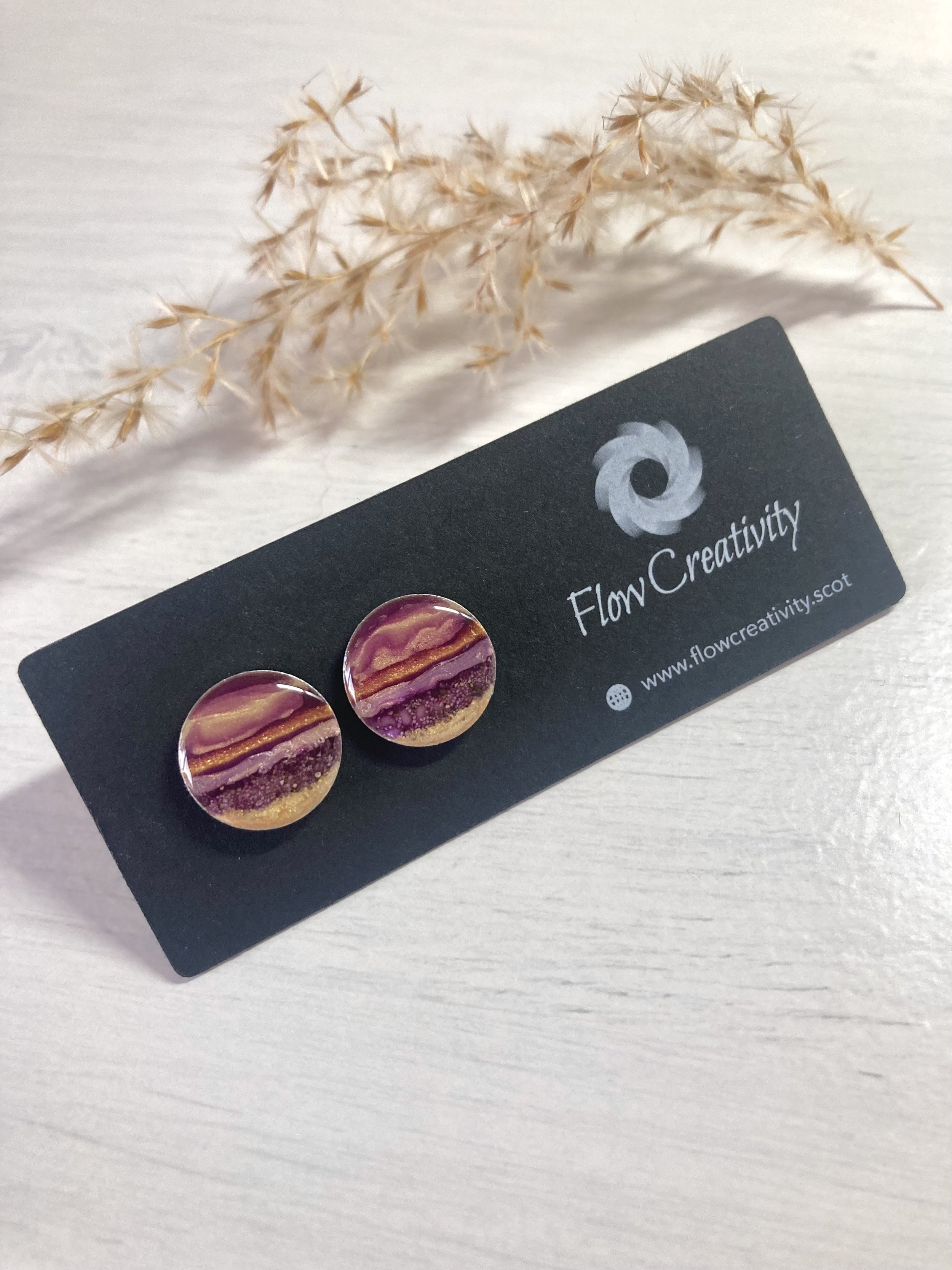
Here’s what’s in the 2026 small batch collection; including for the first time some gorgeous Stud Earrings.

Here’s the link to browse the Limited Edition Collection. Do you know someone who would love the gift of some Arran nostalgia?
Big thanks for reading. What’s your favourite holiday place?